
advenit
Project overview: goal, key challenges, proposed solution and responsibilities:
Part of a UX design project, the goal was to create a sign-up process for an online bank.
Available online banking solutions have cluttered designs, which cause users to be hesitant when deciding to create an account. They want to have a similar experience to other online applications without the need to get involved in the complex banking language. It is essential to design a sign-up process to be user-friendly, provide clear navigation cues and offer fast and understandable navigation elements.
The solution proposed takes well-known, engaging elements from existing sign-up processes and is intended to support users by taking their fear away.
As an UX designer, I led the app and its responsive website design from conception to delivery. My responsibilities in this project included conducting interviews, paper and digital wireframing, low and high-fidelity prototyping, conducting usability studies, accounting for accessibility, iterating on designs, determining information architecture, and responsive design.

Understating the user: user research, personas, problem statements and user journey maps
I conducted several interviews and created empathy maps to understand the needs, goals, and pain points of the users.
A primary user group identified through the results of the research was young professionals who don’t want to take care of too much paperwork but want to have an exciting and fun experience but still feel secure throughout the entire sign-up process.
This group confirmed the need for professional guidance and expertise to solve their pain points. Additionally, new challenges were identified, such as the need to have easy understandable possibilities of investing money without the need to know the classical "banking" language.
The strongest pain points identified were:
1. Experience: Online banking websites don’t provide an engaging browsing experience, which causes frustration.
2. Navigation: Online banking website designs are often very cluttered, which results in confusing navigation.
3. Security: Users have a strong desire for high security without the need for excessive process steps.
The gathered information was then turned into one persona profile: Melina.
She is a busy full-time employee who needs intuitive navigation and the right guidance. Melina doesn’t have the time to get involved with too many bureaucratically driven documents. Banking should be as simple as any other webpage.

After generating the persona, I created a user journey map consisting of the actions and the steps needed during the entire process, from start to finish. This step revealed how helpful it would be for users to have access to dedicated information and which pain points and improvement opportunities could be addressed.

The design process: sitemap, wireframes, low-fidelity prototypes and usability studies
An engaging experience with website navigation was a primary pain point for users, so I used that knowledge to create a sitemap.
My goal here was to make strategic information architecture decisions that would improve overall website navigation.

Taking the time to quickly sketch out different layouts ensured that the next steps considered the user's pain points in terms of experience, navigation, and security.The idea was to create a simple layout that makes it easy for the user to understand and navigate. Stars were used to mark the elements that would be used in the digital wireframes.
Because Advenit’s customers access the site on a variety of different devices, I started to work on designs for additional screen sizes to make sure the site would be fully responsive.

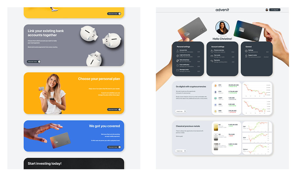
Having decided on the layout, I moved from paper to digital wireframes. This made it easy to understand how the redesign could help address user pain points and improve the user experience. Prioritizing the button locations and visual element placement on the home page was a key part of my strategy.
Homepage is optimized for easy and inviting browsing through reduced text blocks. Creating easy access was essential.

In the usability study, five participants were interviewed. Each session lasted between 20 and 30 minutes. During the first half of the study, the participants were asked to complete redefined tasks. The time on task and user error rate were analyzed. The second half of the study consisted of a system usability scale during which the participants valuated their experience and gave feedback.
The results were gathered, patterns were identified, and insights were prioritized.
1. Log in process: Users wished for clearer information about the needed steps during the sign-up process.
2. Additional features: In the profile settings, users wished to have additional personalized features visible that they could act on.
3. Security related: Users wanted to have the option of adding additional login features depending on which device they were using.
4. Investment: Users wished to have the option to invest in different areas directly from their account.
Refining the design: creating mockups, high-fidelity prototypes and accessibility
Based on the insights from the usability studies, I was able to apply to start the refining process. One of the main aspects was to create a distinguishable appearance and to clearly separate the "log in" from "sign up". This was mainly due to the lack of finalized graphics. The change to the high-fidelity prototype was critical for the users because it gave them a better understanding of the product and made the navigation easier. The changes were further continued in the indication of steps needed to finalize the sign-up process. The experience was enhanced by adding the option to go back during the process and change information.
Before the usability studies
After the usability studies

Additional information provided below the fold.
All changes were applied in the high-fidelity prototype, which was tested in a second usability study.

I learned that even a small design change can have a huge impact on the user experience. When considering the real user needs, these changes can create acceptance in this field, which encourages users to try out new products.
Accessibility considerations within the design.

Visual contrasts
By applying strong visual contrast for the call-to-action buttons, I was able to create a clearer differentiation between the different modes of the app.
Languages
In order to increase the accessibility, I added different languages that the user can choose from.
Consistency
The layout of the available information is determined by the repeatable information architecture. This makes the app easier to navigate.
Takeaways:
The app's positive impact is that it provides users with the trust they desired:
A quote from the second usability study:
"I'm not what you'd call an expert on banking systems, but this app assisted me in opening."Yeah, I have the feeling it gave me the right expertise."
My biggest learning throughout this project was that users can be hesitant about trying new digital products. As long as they don't have the feeling of control, digital experiences can be challenging. By hearing their frustrations, I was able to prove that even online banking can be fun and engaging. In the case of having trouble during a certain process, it always makes sense to provide them with tailored support from experts, especially in banking scenarios.